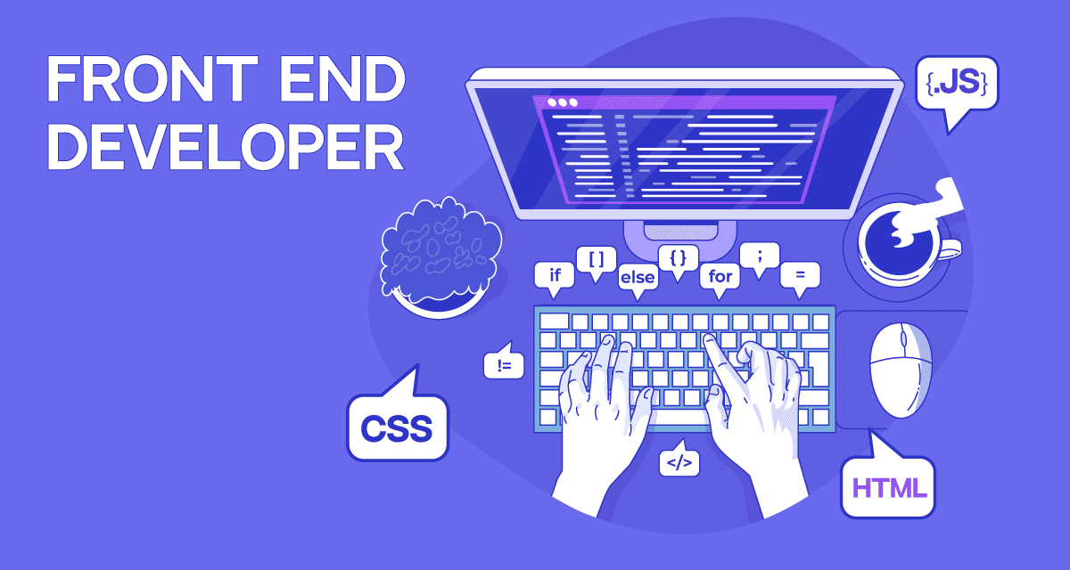
Building Responsive UIs with Frontend


Building Responsive UIs with Frontend Frameworks
Responsive User Interfaces (UIs) adapt seamlessly to different screen sizes, ensuring a consistent experience across devices like desktops, tablets, and smartphones. Modern frontend frameworks like React simplify the creation of such UIs. In this blog, we’ll explore the principles of responsive design, key frontend tools, and a practical example of building a responsive UI using React and Tailwind CSS.
Why Responsive UIs Matter
With users accessing applications on diverse devices, responsive design is critical for usability and engagement. A well-designed responsive UI enhances accessibility, improves user satisfaction, and boosts SEO performance.
Key principles:
- Fluid Layouts: Use relative units like percentages or viewport units (vw/vh).
- Media Queries: Apply styles based on screen size or device characteristics.
- Mobile-First Design: Start with a base design for smaller screens and scale up.
- Flexible Media: Ensure images and videos resize appropriately.
Essential Frontend Tools
- React: A JavaScript library for building component-based UIs.
- Tailwind CSS: A utility-first CSS framework for rapid styling.
- Vite: A fast build tool for modern web development.
- Responsive Design Testing Tools: Browser DevTools or services like BrowserStack.
Building a Responsive UI with React and Tailwind CSS
Let’s create a simple responsive dashboard with a navigation bar and content area using React and Tailwind CSS.
Step 1: Set Up the Project
Initialize a React project with Vite and install Tailwind CSS:
npm create vite@latest responsive-dashboard -- --template react
cd responsive-dashboard
npm install
npm install -D tailwindcss postcss autoprefixer
npx tailwindcss init -p
Step 2: Configure Tailwind CSS
Update tailwind.config.js:
/** @type {import('tailwindcss').Config} */
export default {
  content: [
    "./index.html",
    "./src/**/*.{js,ts,jsx,tsx}",
  ],
  theme: {
    extend: {},
  },
  plugins: [],
}
Add Tailwind directives to src/index.css:
@tailwind base;
@tailwind components;
@tailwind utilities;
Step 3: Create the Responsive UI
Replace src/App.jsx with the following code to build a responsive dashboard:
import { useState } from 'react';
import './App.css';

function App() {
  const [isMenuOpen, setIsMenuOpen] = useState(false);

  return (
    <div className="min-h-screen bg-gray-100">
      {/* Navbar */}
      <nav className="bg-blue-600 text-white p-4">
        <div className="container mx-auto flex justify-between items-center">
          <h1 className="text-xl font-bold">Responsive Dashboard</h1>
          <button
            className="md:hidden"
            onClick={() => setIsMenuOpen(!isMenuOpen)}
          >
            <svg className="w-6 h-6" fill="none" stroke="currentColor" viewBox="0 0 24 24">
              <path strokeLinecap="round" strokeLinejoin="round" strokeWidth="2" d="M4 6h16M4 12h16m-7 6h7" />
            </svg>
          </button>
          <ul className={`md:flex space-x-4 ${isMenuOpen ? 'block' : 'hidden'} md:block absolute md:static bg-blue-600 w-full md:w-auto top-16 left-0 p-4 md:p-0`}>
            <li><a href="#" className="block py-2 hover:text-blue-200">Home</a></li>
            <li><a href="#" className="block py-2 hover:text-blue-200">Analytics</a></li>
            <li><a href="#" className="block py-2 hover:text-blue-200">Settings</a></li>
          </ul>
        </div>
      </nav>

      {/* Main Content */}
      <div className="container mx-auto p-4 grid grid-cols-1 md:grid-cols-2 lg:grid-cols-3 gap-4">
        <div className="bg-white p-6 rounded-lg shadow-md">
          <h2 className="text-lg font-semibold">Card 1</h2>
          <p className="mt-2 text-gray-600">This is a responsive card with sample content.</p>
        </div>
        <div className="bg-white p-6 rounded-lg shadow-md">
          <h2 className="text-lg font-semibold">Card 2</h2>
          <p className="mt-2 text-gray-600">Adjust the screen size to see the layout adapt.</p>
        </div>
        <div className="bg-white p-6 rounded-lg shadow-md">
          <h2 className="text-lg font-semibold">Card 3</h2>
          <p className="mt-2 text-gray-600">Tailwind CSS makes styling easy and responsive.</p>
        </div>
      </div>
    </div>
  );
}

export default App;
Step 4: Run the Application
Start the development server:
npm run devOpen http://localhost:5173 in your browser to view the responsive dashboard. Resize the window or use DevTools to test responsiveness across devices.
Explanation
- Navbar: A responsive navigation bar with a hamburger menu for mobile devices, toggled using React’s
useState. - Content Area: A grid layout with cards that adjusts columns based on screen size (1 column on mobile, 2 on tablets, 3 on desktops).
- Tailwind CSS: Utility classes like
md:flex,grid-cols-1 md:grid-cols-2, andhidden md:blockensure responsiveness. - React: Components manage state (e.g., menu toggle) and render the UI efficiently.
Best Practices for Responsive UIs
- Mobile-First Approach: Write base styles for small screens, then add media queries for larger ones.
- Consistent Breakpoints: Use standard breakpoints (e.g.,
sm,md,lgin Tailwind). - Accessibility: Ensure keyboard navigation and screen reader compatibility.
- Performance: Optimize images and minimize CSS/JavaScript bundle size.
- Testing: Test on real devices or emulators to verify responsiveness.
Conclusion
Building responsive UIs with frontend frameworks like React and Tailwind CSS streamlines the creation of user-friendly, device-agnostic applications. The dashboard example demonstrates core responsive design techniques, but frontend development offers endless possibilities for interactive and dynamic interfaces. Start experimenting with React and Tailwind to craft your own responsive UIs today!

Application Security Best Practices

Ethical Hacking Techniques

Data Science with Python

Backend Development with Node.js

Fullstack Development Guide

Network Security Essentials